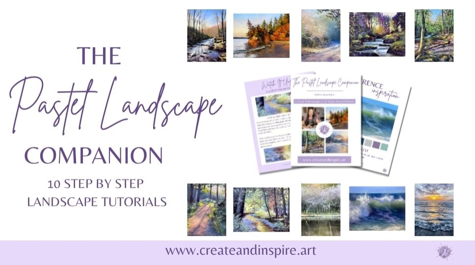
The Pastel Landscape Companion
A Visual Walkthrough of 10 Nature-Inspired Demos
Turn Your Pastel Landscapes into Show-Stopping Artwork — One Tutorial at a Time


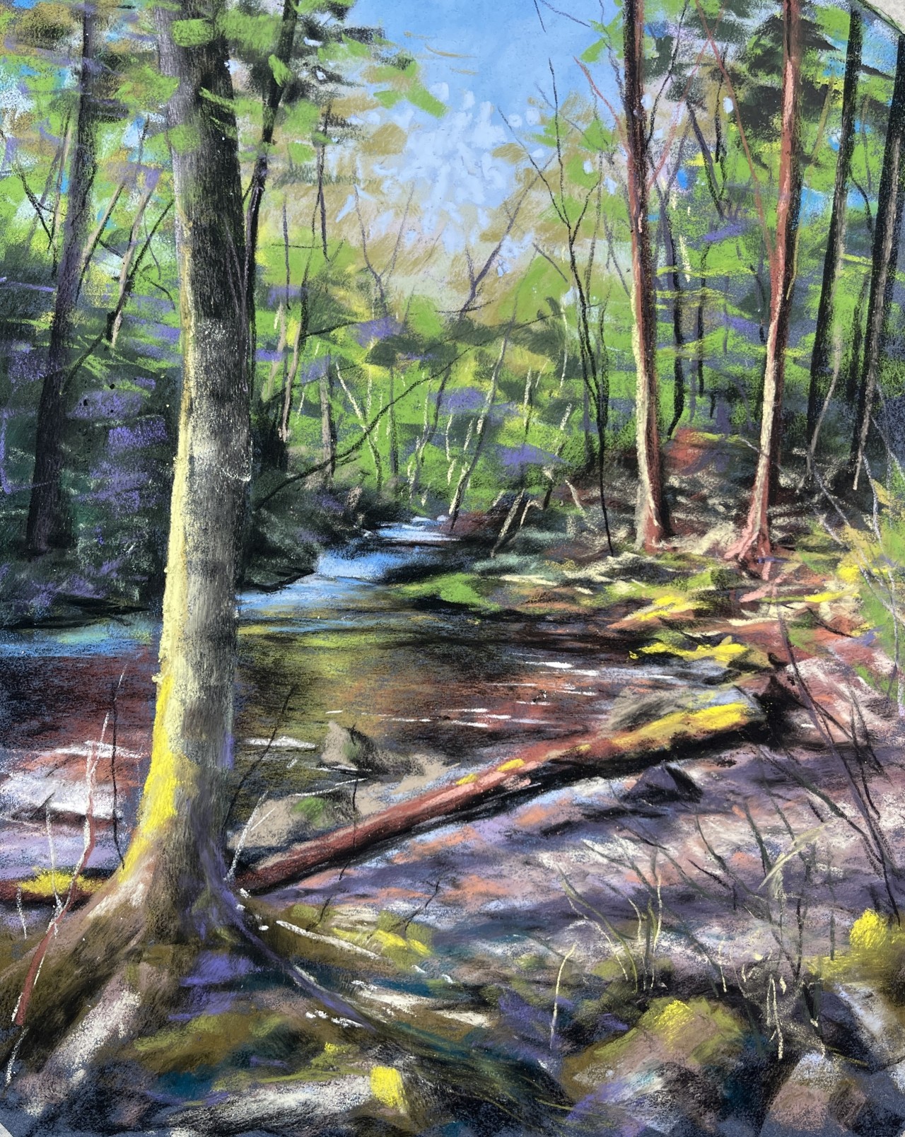


Learn how to bring life, depth, and harmony to your landscapes with 10 fully guided PDF pastel tutorials — each broken into just 4 clear, achievable steps.
Do any of these sound familiar?
Your skies look flat or streaky instead of soft and glowing
Greens in your landscapes always end up muddy or unnatural
You get lost in the middle of a piece and don’t know the next step
Distant mountains and trees look just as sharp as the ones in front (and it feels “off”)
You waste precious time guessing at colors and hoping they’ll work together
You’ve tried following videos, but the pace or style leaves you feeling overwhelmed I’ve been there — frustrated, second-guessing, and feeling like I was missing some secret everyone else knew.
When I first started with landscapes, I’d stare at my blank paper wondering how to even begin. My skies felt flat, my mountains had no depth, and my greens? A muddy mess. After years of trial and error, I cracked the code — and now I’ve packaged it into a set of 10 step-by-step tutorials so you can skip the guesswork and actually enjoy the process.
What You’ll Get Inside Every tutorial includes:
📸 A high-quality reference photo
🖌 Suggested materials list
📚 4 steps with photos & tips
💡 My personal guidance for blending, layering, and color harmony
⚡ Thumbnail worksheet
✏️ Checklist for accountability
Why This Works Each tutorial focuses on a specific landscape skill:
Creating glowing skies without muddying colors
Making mountains recede into atmospheric distance
Adding believable reflections in water
Filling snow with color so it feels alive
Bringing texture to fields, trees, and foreground elements You’re not just copying — you’re building your skills piece by piece.
Who It’s For Perfect if you:
Love the look of pastel landscapes but don’t know where to start
Want clear, structured steps (without overwhelming lectures)
Are a beginner or intermediate artist ready to uplevel your skills
Need bite-sized projects you can actually finish

"I finished my first tutorial in a weekend and couldn’t believe how good it looked"
Sarah M
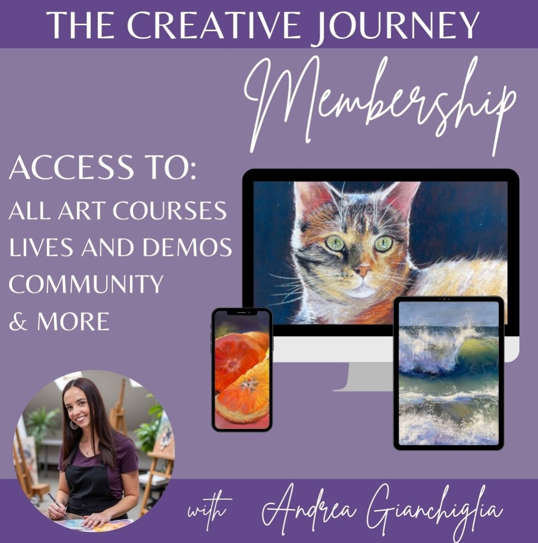
Want to see these drawings done step-by-step on video?
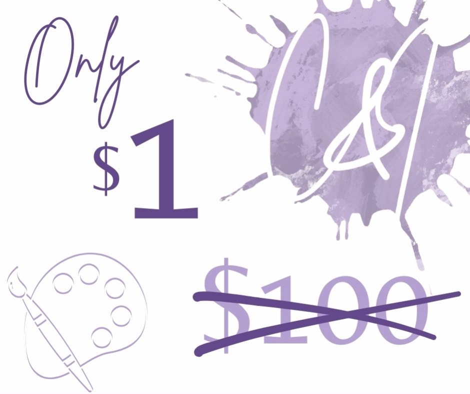
For just $20/month
Join the Membership for Instant Access to the Entire Video Library, and so much more.
✓ Instant access to tutorials
✓ Downloadable resources
✓ Monthly live lessons and critique sesions
✓ Encouraging community group
✓ Cancel anytime


"Andrea’s step-by-steps are like having her in the room cheering you on.”
Anna H

Course Curriculum
Course Pricing

Andrea Gianchiglia
Artist | Instructor