When the Sky Feels Flat and the Greens All Look the Same: A Love Letter to Stuck Landscape Artists
 Andrea Gianchiglia
When the Sky Feels Flat and the Greens All Look the Same: A Love Letter to Stuck Landscape Artists
Have you ever finished a landscape painting and just… shrugged?
You stare at it. You tilt your head. You squint. You hold it upside down like some kind of ancient art ritual—and still, the sky feels flat, the trees look like a broccoli explosion, and somehow all your hard work adds up to… “meh.”
Friend, I’ve been there. I still remember one of my earliest attempts at a dramatic sunset. I was determined to capture the golden light streaming over a field—those rolling hills, the quiet drama of it all. But what I ended up with looked more like mashed potatoes under a yellow heat lamp. I stared at that sky for hours trying to figure out what it needed. (Spoiler: it wasn’t more yellow.) The Landscape Struggle is Real Let’s just say it—landscapes are not as peaceful to paint as they are to look at. Here’s what I know from experience (and from teaching so many students):
• Skies feel like blank filler space. You know they need something, but adding more blue doesn’t always solve it.
• Greens turn into a visual soup. Suddenly, the trees, the grass, the hills—all feel like the same flavor, and not a very good one.
• Everything is midtone. Without strong values or edges, your painting can look like it’s being viewed through a foggy window (but not the good kind of fog).
• And worst of all? That sinking feeling of “I thought this would look better…” But Here’s the Good News None of this means you’re not good enough. It means you’re growing—and your eyes are learning to see what your hands haven’t quite figured out how to say yet. And that gap? It’s totally bridgeable. I’ve picked up a few small-but-mighty tricks over the years that made a huge difference in my landscapes—and maybe they’ll help you too: Quick Wins for When You’re Stuck in the Greens:
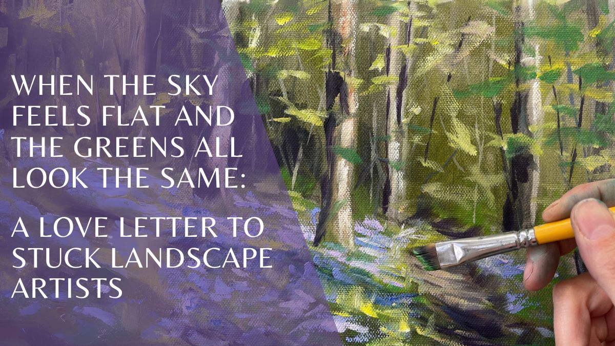
• Tame the green chaos with purple. No, really! A touch of purple in a sea of green can help neutralize it just enough to create harmony without turning the whole thing into mud. Try it in shadows or in cooler background trees—it’s magic. And bonus: purple makes everything feel a little fancier.
• Use a “mediator” color for smooth transitions. When two colors are fighting on your paper (like a bossy blue and a loud orange), drop in a third tone that’s friends with both. I call it the “mediator.” This middle color helps ease the tension and makes the blend feel intentional.
• Don’t skip the sky transition. Instead of blue-blue-blue across the top, build in a soft gradient. Even adding a touch of soft peach, lavender, or gray near the horizon gives your sky a gentle breath of atmosphere.
• Squint test = best test. Step back, squint, and ask: does my painting feel like it has depth? If everything is the same value, your eye won’t know where to go. Try pushing your darks deeper in the foreground and letting the distance get a little hazy.
These little shifts add up to big breakthroughs. And they make your paintings feel alive—like they’re telling a story, not just showing a place. ⸻ If your landscapes have been feeling off… if you’ve been doubting your ability to bring a scene to life… this is your sign to take a breath and gently try again. You’ve got the heart. You just need a little support.
I created my Landscape Bundle to walk alongside you through these struggles. Inside, you’ll find a collection of step-by-step demos exploring skies, foliage, and atmosphere—all designed to help you see more clearly, simplify with confidence, and finally get your greens and values working together instead of against you.
Yes, I use pastel throughout—it’s my favorite for adjusting values on the fly—but the magic is in the way we slow down and build the scene together.
Come see what’s possible inside the Landscape Bundle. I’ll walk you through it—one sky, one tree, one breath of fresh air at a time. And hey, when in doubt… add purple.
Blog Comment Box Creation Guidance (Billboard (Square)) by Andrea Gianchiglia