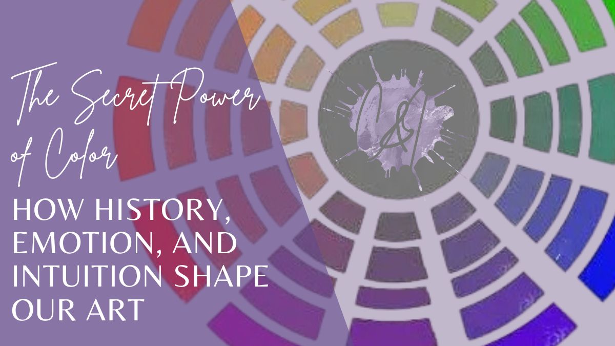
The Secret Power of Color: How History, Emotion, and Intuition Shape Our Art
 Andrea Gianchiglia
Have you ever looked at a painting and felt something before you even knew what it was? That’s the power of color.
Have you ever looked at a painting and felt something before you even knew what it was?
That’s the power of color.
Before a viewer reads your subject or notices your brushwork, they’re hit with a mood—warmth, tension, nostalgia, peace. All of that comes from your color choices. And while we often think of color as this intuitive, artsy thing (and it can be!), there’s also a deep and fascinating science—and even a bit of history—behind it.
Let’s dig in.
🎨 A Little Color History (It’s More Wild Than You Think)
Color theory has been around for centuries. It dates all the way back to Sir Isaac Newton, who first created the color wheel after experimenting with light and prisms in the 1600s. Later, artists and scientists—from Goethe to Munsell—developed systems that went beyond just mixing paint. They explored how colors affect us psychologically and emotionally.
Think about it:
-
Red: urgency, passion, danger, power
-
Blue: calm, sadness, trust, depth
-
Yellow: joy, energy, hope—but also anxiety if overused
-
Purple: luxury, creativity, spirituality (…you knew I’d mention purple 💜)
These associations didn’t just happen. They were shaped by culture, time, and storytelling—and they’re still powerful tools in your artist toolbox today.
💡 Color Isn’t Just Pretty—It’s Persuasive
Here’s the thing I wish every artist knew:
Color isn’t just there to make your work “pretty.” It’s there to make your viewer feel something.
With just a shift in tone or temperature, you can completely change the message of your piece.
-
A stormy blue sky with hints of yellow? Hope on the horizon.
-
A bright green pasture with purple shadows? Magic, mystery, whimsy.
-
A pale washed-out palette? Nostalgia or memory.
-
Vibrant oranges and reds? Heat, action, boldness.
And that’s what makes mastering color so important—especially if you want to grow as an artist who connects with your audience.
😖 What’s Getting in the Way?
If you’ve ever said:
-
“I just don’t get color theory.”
-
“My colors look muddy, not vibrant.”
-
“I’m scared to add bold color—I always play it safe.”
-
“I don’t know how to make a palette that works.”
You’re not alone. I’ve taught hundreds of students who were nervous about color. And guess what?
🎯 It’s not about being naturally gifted with color. It’s about learning how to see it, mix it, and use it with intention.
🌱 My Own Turning Point
There was a time (especially early in my career) when I avoided color. I’d use soft browns and dull greens. Nothing was bad, but nothing popped, either.
Then, one day, I pushed myself to use a wild shade of purple in a landscape. I thought it might ruin the piece—but instead, it gave it life. A quiet shadow that felt mysterious and alive.
From that moment on, I was hooked. I started seeing color differently. I stopped copying the reference photo and started painting what I felt.
And that changed everything.
📚 Ready to Go Deeper? Let’s Demystify Color Together
If you’ve been avoiding color theory because it sounds stiff or overwhelming… I’ve got you.
I created a bite-sized, friendly, no-intimidation Color Theory course that breaks it all down in a way that makes sense—and feels empowering.
👩🎨 You’ll learn:
-
How to choose the right reds, yellows, and blues to avoid mud
-
How to create your own palette with confidence
-
Why certain color combos trigger emotional reactions (and how to use them!)
-
When and how to break the rules on purpose
-
How to make colors glow without just adding white
-
Why neutrals are your secret weapon
✨ It’s about 2 hours of content, broken into short, easy-to-digest lessons—plus a pop quiz and “final exam” that are way more fun than they sound.
🟣 You can take it at your own pace, revisit it anytime, and start seeing immediate results in your next piece.
👉 Click here to check out the course
💬 Don’t Wait for “Someday”
A lot of artists wait to learn color theory until they feel “ready.” But here’s the truth: mastering color isn’t something you do after you’re already good—it’s what helps you become great.
Whether you’re sketching cows in pastel, building atmospheric seascapes, or diving into portrait work… color is always part of the story.
So let’s tell it well. Let’s make it sing.
You can start today. Your art (and your viewers) will thank you.
🎨 With color and confidence,
Andrea 💜